Palermo,Italy
Redesign Branding for Tourism
Font : Custom Lettering (Palermo Logotype)
Secondary Font: Sharp Grotesk
Supporting Font: Montserrat
2024
For this project, I reimagined the visual identity for the city of Palermo, Sicily.
As a tourism/historic destination,I wanted to bring a modern, fun approach
to this great city while keeping the roots and culture it is known for.
Their Logo
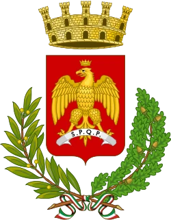
Their logo features a crest with a golden eagle representing Power, Nobility, and Dominion.
The symbol was awarded to show the loyalty and and stratigic importence.
The letters S.P.R.Q. are latin for “The Senate and the People of Palermo”.
The colors red and yellow represent the end of a time of rule in Palermo.
The Redesign:
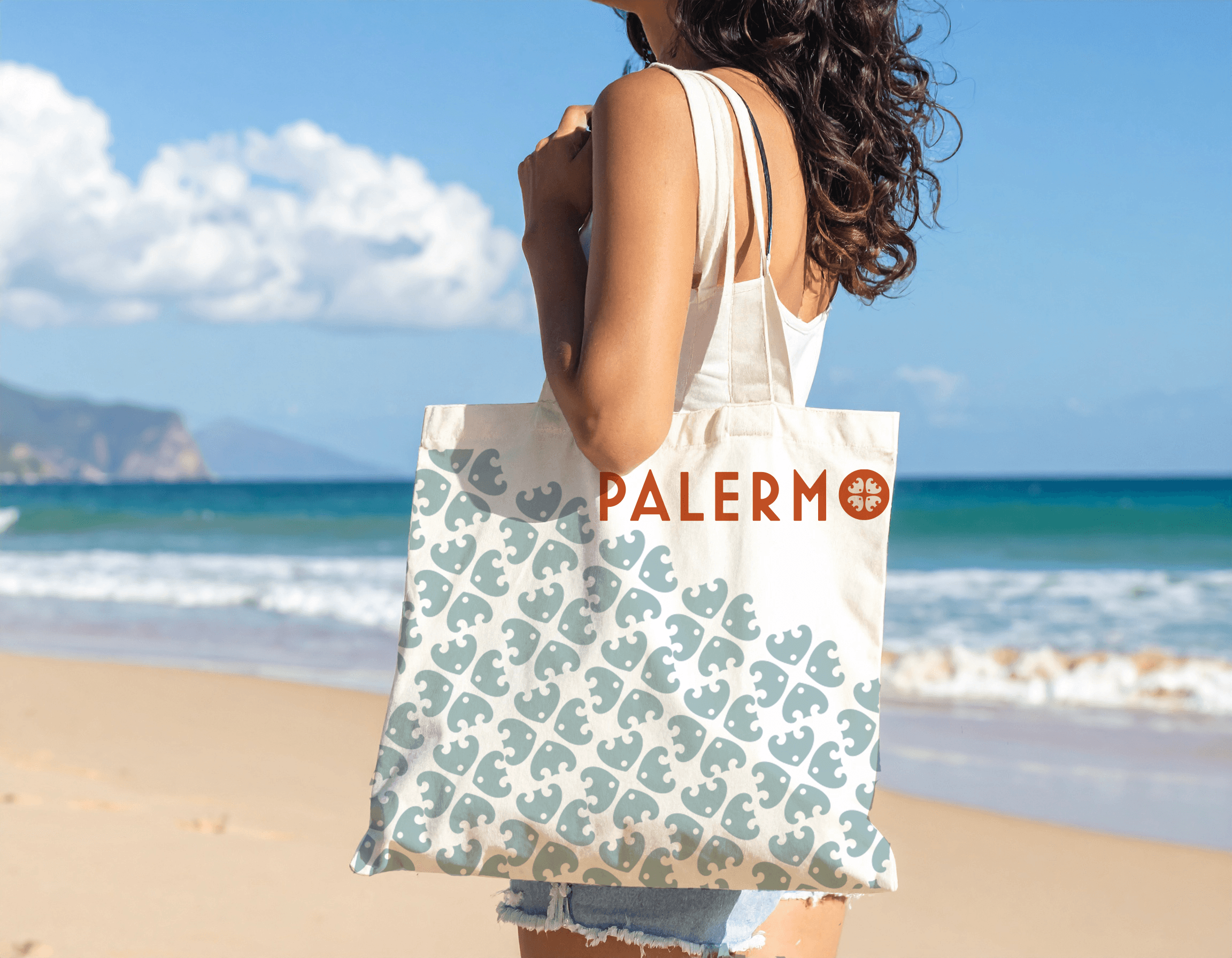
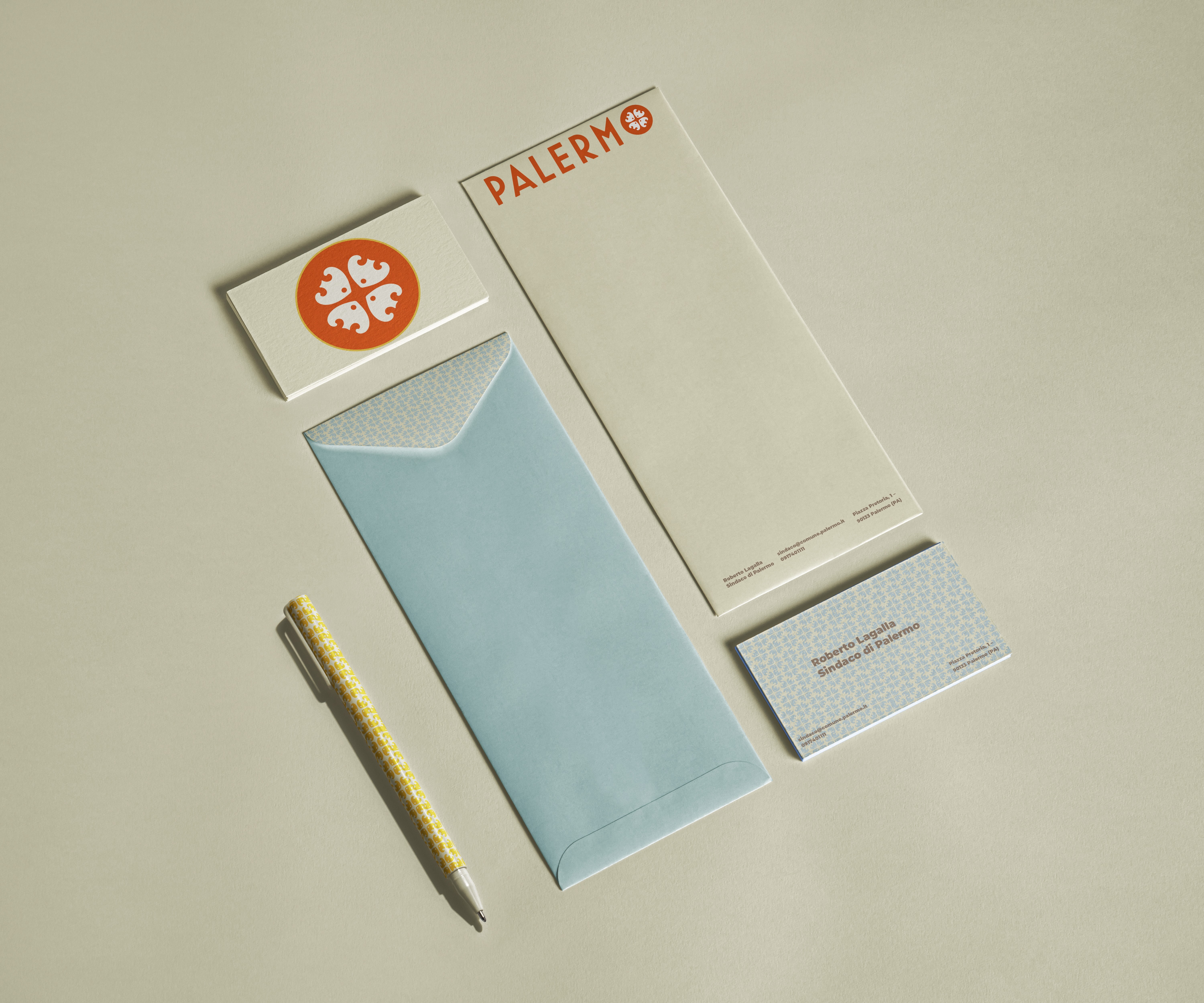
For my redesign, I wanted to still use the traditional colors
but also bring about the coastal representation of the region,
showcasing the architectural elements of the city.



Iconography

Brand Colors


HEX:#BD593A
HEX:#A7BFC2
HEX:#766B5F
HEX:#DFAC3A
HEX:#DDDCBC
Secondary Logo

